Note to the reader: I wrote the following essay a number of years ago, which was intended for a book on the Minneapolis artist ‘Zine called Artpolice. Covid, the war in Ukraine, Brexit, and a host of other world events have, hopefully, only delayed publication, But as the future is unknown, I thought it was time to make the essay available now

Artpolice was an artist collective magazine that was based in Minneapolis, Minnesota, and published between 1974 and 1994. Their intention was to produce an original artwork in magazine form, three to four times a year, that included works from a core, if changing, group of artists plus a long roster of occasional contributors. Aesthetically, it offered a fantastic brew of Imagist and Dada approaches, often in the form of lurid and sometimes scandalous imagery. Intellectually it aimed to disrupt the established order. It was also fun.
Culturally and technologically the world in which the members of the Artpolice grew up, attended school, and produced Artpolice was very different from the time in which we are living now. Even if you grew up during those decades, as I did, the particular urgency of those years, how tactile the city-landscape felt then as compared to the quicksilver slickness of today’s digitally focused environment, is hard to conjure up as more than a pale impression. This was, after all, a time before everyone carried a smart phone in his or her pocket, but rather families would share a single landline phone in their home. There were no personal computers, and no Internet. Everything, including culture, was predominantly local.
During the 1960s in the Midwestern American city of Chicago, Illinois, the gritty culture of a largely blue-collar society was just reaching its apogee. It was still, at that time, a city of meatpackers and warehouse workers, machinists and assemblers. For even as fancy department stores sporting now long-gone names like Marshall Field’s and Carson Pirie Scott attracted upscale shoppers to the city’s downtown “Loop” district, and flagship hotels such as the Conrad Hilton, the Drake, and the Blackstone catered to an endless stream of visiting conventioneers, the occupation of most of the city’s nearly three million residents at this time was more aligned with the bus drivers and factory workers who, supplemented by immigrants from eastern Europe and African-Americans fleeing the Jim Crow south, toiled in the “City of Broad Shoulders.”

The awareness of this reality was as tangible as the air we breathed, often literally, for on the days when the wind came up from the south it carried with it the pungent scent of the then still active Chicago Stockyards, where 75,000 hogs, 21,000 cattle and 22,000 sheep were kept and slaughtered in its heyday. Or, if the wind was a bit more from the southeast, the acrid smell emanating from the flaming stacks of steel mills and oil-refineries dotting Lake Michigan’s southern shore would invariably cause an involuntary wince upon first reaching your nose.
It was in this city as a twelve-year-old in 1966 that I would ride the elevated train, commonly referred to as the “L”, from my upper North-side Rogers Park neighborhood south to the downtown “Loop” area to attend Saturday art classes at the Chicago Art Institute. After class, descending the building’s stone stairs between the iconic lions, I would be confronted with a decision: should I turn right or left?

Right took me north, up Michigan Avenue, where walking two short blocks would bring me to the Chicago Public Library’s Tiffany domed main building. Once inside, I would climb the marble stairs to the Humanities department, and spend hours wandering the glass-brick catwalks investigating its towering stacks of books. This 19th century wonder of a building was, mind you, just a block away from the bus terminal on Randolph Street where the homeless would often spend their days and nights during the freezing cold winters.
Left from the Institute’s steps took me south, down Michigan Avenue past Symphony Hall, until another turn to the right sent me down Van Buren Street, where I would eagerly explore the last remains of downtown’s Skid Row. There, bathed in the flickering light and shadows cast by the elevated tracks above, stood the last few burlesque houses, shuttered during the day, with their faded black and white photos of tasseled semi-nude women and pencil mustached M.C.s. In between and across the street from these aging theaters were a dozen or so tired flophouses, transient hotels, and automat cafeterias. Those remnants of the previous half century have long ago vanished under the wave of gentrification that washed over cities across America as the century came to an end.

City of three million though it was, in truth Chicago was not that different from the rest of the small cities and towns across America. There were no “big box” stores yet; each town still had its own local hardware store and diners. The very idea of being American meant to think about average, everyday people as having lives full of meaning and stories worth telling. Chicago authors made heroes of these regular folk; Studs Terkel did countless interviews with WWII vets and blue-collar workers, Mike Royko took on the Chicago political machine, and novelist Nelson Algren described the life of the hustlers and drug addicts that might have frequented those Van Buren Street burlesque houses only a decade earlier.
The focus on the interests of the working class instead of the elite had its counterpart in the visual arts as well. For decades there had been artists interested in creating an American art free from the constrictors of European art history, an art about and for everyday people who worked the farms and factories rather than the privileged few, an art that put the individual and identity at its center. This desire manifested in numerous variations through the work of different artists at different time periods and was referred to by various names along the way – American Primitive, Regionalism, Ashcan to name just three – and was, by the 1960s, reaching what was to be its high point in Chicago. Indeed, while I was walking down those Art Institute steps in the front of the building, Frank Gaard, who was to bring these ideas to Minneapolis, was attending School of the Art Institute of Chicago (SAIC) classes in the back of the building.

Gaard, born in 1944, had grown up in this milieu, in the Chicago working class neighborhood of Logan Square. His father painted factories, specializing in painting the large water tanks that would serve entire towns, and he was a union man. Between 1958 and 1962 Gaard attended Lane Tech, a science and technology high school which in the early sixties was still for boys only, and a good part of whose mission at that time was to prepare those boys for work in the many factories that dotted the Midwest. Lane Tech offered multiple levels of art classes, albeit with the main focus commercial applications such as illustration and design. These classes were a boon for the teenaged Gaard, as was the Art Institute of Chicago program for High School students he was able to attend every Thursday during his junior and senior years. After graduation, he immediately applied and was accepted at the School of the Art Institute of Chicago. There he studied under artist Ray Yoshida and art historian Whitney Halstead, who were among a pivotal group of professors clarifying ideas and ways to carry forward an American vision of the individual. It had, as mentioned above, been referred to by many names in the preceding decades, but now it had a new name: Chicago Imagism.
Chicago Imagism, so named by art critic Franz Schultz in his 1972 book Fantastic Images: Chicago Art since 1945, incorporated the formal and figurative philosophy of the preceding American movements while also finding inspiration in contemporary, mass-produced, materials drawn from popular culture. This included wrestling posters, pin-ball machines and, of course, comics. One in particular, Nancy by Ernie Bushmiller, was universally held in high regard by the Chicago Imagists for its reliance on image over dialogue to tell its “jokes,” which were often a wry commentary on how we perceive space and context. While the Chicago Imagists did not codify the rules of this American movement, they, like their predecessors, can be described as having a shared philosophy in how they approached art making.
As mentioned, these artists were heavily invested in creating an art about and for everyday people. In practice, this led to a nearly universal rejection of pure abstraction as being too distant from common experience, and an embrace of recognizable imagery and figuration. At the same time, there was a rejection of linear perspective and verisimilitude, or realism, in favor of images abstracted through the prism of the artist’s psyche. Whatever their stated reasons might be, one undeniable outcome of their rejection of linear, or Renaissance, perspective was that it allowed these artists to reclaim the two-dimensional depiction of three-dimensional space back from a formulaic convention and imbue it with a psychological impact in line with the rest of their aesthetic decisions. And, as the psyche became the doorway through which all other information was to pass, it naturally followed that dreams, sex, and the unconscious all came to be considered exceptionally fertile ground for subject matter, with the artists viewing their work as a form of psychological portraiture reflecting equally on the subject and the maker.
With Imagism placing so much weight on role of the individual, it makes sense that the development of a deeply personal style capable of embedding this information into their art was considered essential. This resulted in maximizing the personalization of their color palette, paint application, and line value. One aspect that seemed to flow naturally from the need to personalize can be seen in an intense interest in drawing and, not infrequently, printmaking. The attraction to printmaking could be ascribed to its relation back to drawing, and also as a way to make their work more readily available to a wider audience. The particular interest in drawing can be understood on a number of levels. As with handwriting, there is an automatic quality to the act of drawing, an unconscious inclusion of personality within the mark making. It is also, by its very nature, intimate and diaristic. One must add, too, that drawing provides a satisfying directness and approachability for artist and viewer alike.
As an aside, it should be noted that the personalization of each artist’s approach could also create a conflict for those seeking to establish a shared connection among these artists. That is, there is a disconnect between the traditional idea of a movement as a shared style, and that of a movement foregrounding a deeply personal style, where the idiosyncrasies of the artist’s vision could, and often would, obscure the underlying connections to the other artists engaged in a similar pursuit.
This potential for “not seeing the forest through the trees,” so to speak, was addressed by one more thing these artists shared in abundance. For in line with their underlying belief that the rights of any individual are equal to those of the elite, these artists, especially the group that came to be known as the Imagists, took organizing and curating exhibitions of their own work as something well within their purview. Starting in the 1950s and extending into the 1980s, these artists came together to mount many group exhibitions at alternative, non-commercial spaces – most particularly the Hyde Park Art Center, where Don Baum, another Imagist, was the exhibitions director. These shows all had playfully imaginative names such as The Hairy Who, The False Image, The Non-Plussed Some, Marriage Chicago Style, Non-Naïve, and, at the Chicago Museum of Contemporary Art, Don Baum Sez: Chicago Needs Famous Artists – and helped viewers more readily see their shared interests.
But, so, let us now jump forward seven years and 400 miles north, from Chicago in 1966 to the Minneapolis College of Art and Design (MCAD) in 1973. Perhaps a bit intimidated by my hometown art school, I was lured to MCAD by its hip college catalogue and progressive application policy to another Midwestern city whose significantly smaller population seemed to me, as it had for many of my fellow students, a less threatening and more manageable environment.

Much in America had changed by then, for the intervening years had seen multiple political assassinations, police riots, the Kent State shootings, and the Watergate scandal had just come to light. The military draft for the Viet Nam War was still weighing heavily on the head of every 19-year-old male (my own draft number was 287, and Robert Corbit, a core member and major contributor to Artpolice was a Viet Nam veteran). In the aftermath of all of this, American culture was shifting from the optimism of the sixties into a darker, more suspicious time. In this fraught moment Artpolice took form.
Gaard, ten years my senior, had been hired at MCAD as an assistant professor seven years prior my own arrival. This was after he had graduated from the SAIC in 1967 with a B.F.A. and, wanting to “get as far away from my family as possible,” had headed to Oakland’s California College of Arts and Crafts (CCAC) for his M.F.A., which he received in 1968. It is worth adding that he had applied there rather than the San Francisco Art Institute because he had heard that CCAC was a blue-collar, non-elitist place where he would be more comfortable and, unknown to Gaard but fortuitously, Peter Saul had recently begun teaching there. Gaard had seen Saul’s paintings at Chicago’s Frumkin Gallery, and the artist’s bad-boy politics, super-charged fluorescent palette, and monumental canvases had made a definite impression on the young art student, an impression made stronger by his time studying with Saul.
Now at MCAD, Gaard’s duties including teaching the freshman Foundation course. Students of any given class can sometimes mesh in unique ways, and Gaard’s spring semester class of 1973 seemed especially charged with excitement. I was in that class, along with future Artpolice contributors Fritz Wolfmeyer, Andy Baird, and Chris Woodward, and we were all having a blast engaging with each other during the classroom talks about Duchamp, art magazines, comic books, Claude Levi-Strauss, conceptual art, painting, and the responsibility of the artist – a dust-devil of ideas floated aloft by Gaard’s frequently manic delivery.
Having seen the self-produced and comic influenced Hairy Who exhibition catalogues, Gaard was keenly interested in producing a cooperative artist magazine as an artwork in its own right. He held up other examples as well, including Avalanche magazine, whose eccentric artist publisher Willoughby Sharp had just appeared the previous semester as a visiting artist, and whose “lecture” had consisted of him presiding over a student dog show while imbibing an entire fifth of Jack Daniels whisky. As I said, it was a different time.
While producing an artwork in magazine form was not the only project we worked on, it did occupy a good deal of our class discussion time. We talked about format, layout, cover ideas, and the visual properties of text. Each of us was to contribute something, and its cover illustrated this idea as a collaged grid of individually drawn squares. What to title this publication became a seemingly never-ending conversation. Many serious, silly, sarcastic, and ironic names came and went, until Gaard bemoaned, “all of these ideas seem a bit…fuzzy,” and Fuzzy became the name of the first issue produced. The name of the next issue was word play on our discussions about narrative and the privilege of the narrator – how the word history can be heard as “his story,” thus His Story for publication number two. Perhaps because artists as a rule give each artwork its own title, or perhaps because the first two titles felt somehow tentative, there was no thought that we had to stick with what we had, and the conversation about titles continued.


Along with influences such as Avalanche magazine, Hairy Who catalogues, R. Crumb underground comics, Nancy cartoons, Kurt Schwitters’ periodical Merz, the political collages of Dadaists Hannah Höch and John Heartfield (and a host of others) was a sensationalist tabloid known as The National Police Gazette. There was something enticing about this soft-core periodical, which Wikipedia helpfully describes as “the forerunner of the men’s lifestyle magazine, the illustrated sports weekly, the girlie/pin-up magazine, the celebrity gossip column, Guinness World Records-style competitions, and modern tabloid/sensational journalism.” It wasn’t just the ornately embellished magazine logo, or the content that ranged from salacious to taboo, or even its reliance on fraught, densely rendered drawings, although all of those things echoed our own vision. Rather it was the name itself, with its oddly official invocation of authority in the form of those whose job it is to watch over us, ferret out crime, and defend the established order, placed in service to the most prurient content imaginable. In short, and in an unintentional example of Dadaist inversion, Police Gazette claimed the high ground while reveling among the low-lifes. Was this not descriptive of our own aspirations? Plus, if that wasn’t enough, there was the fun of us describing ourselves, the most powerless of art students, as somehow the enforcers of the art world, as well as the homonym humor of saying the name slowly as art pu-leeze (art please!). So was born the name Artpolice, which with minor variations and team side projects (Art Police Gazette, Artpolice Express, Artpolice Comics, Artpolice Newsletter, Artpolice Comics Special Dada issue), continued as a collaborative labor of love for the next two decades

There are, no doubt, a nearly infinite number of reasons why artist projects take on any given form, with culture, location, and the state of the economy being just a few of the factors that might come into play. In Chicago, for instance, as with many cities during the 1970s, white flight and an aging infrastructure had created an abundance of available, low rent, industrial spaces and storefronts just outside the downtown “Loop.” As there were few commercial galleries at this time and given the ethos of not waiting for institutional curators or dealers to tell your story, along with the model provided by the Hyde Park Art Center, it was not long before a crop of artist run alternative galleries quickly proliferated: A.R.C., Artemisia, N.A.M.E., and Randolph Street, to name a few.
Minneapolis in the 1970s boasted an impressive cultural scene, with the Minneapolis Institute of Art, the Walker Art Center, the Guthrie Theater, and the Minnesota Symphony Orchestra. Even Dayton’s, the local major department store, had its own serious art gallery; the year I was there they had exhibitions by Shusaku Arakawa, Joseph Beuys, and Andy Warhol. But with a population approximately a tenth the size of Chicago, and not nearly the number of inexpensive available rental spaces, setting up and running an alternative gallery was a much more daunting proposition. One can imagine that this might be especially true for a group of poor young artists fresh out of art school. On the other hand, a kind of portable, mail-able art exhibition in the form of a magazine might provide an affordable solution.

Gaard and his students had created Fuzzy, a publication with an admittedly very small run, in the fall of 1973, and two more in the summer of 1974, including His Story, with cover art by Gaard and inside art works by Wolfmeyer, Joe McDonnell, Baird, and Woodward, and one with no title but featuring an insanely ambitious and wonderful flocked cover created by Baird and Woodward, a Gaard page titled Artpolice Newsletter, and inside artwork by Ed Rath, Wolfmeyer, and McDonnell. In the summer of 1975, with the help of an expanding roster of Gaard’s students, they created a fourth one, which for the first time featured Artpolice on its cover by McDonnell and inside art works by Gaard, Rath, Wolfmeyer, Woodward, Baird, Mark Bueide, Keith A. Smith, Bill McKearn, Bernie Van Marm, and Jim DeWitt. Even then the student collaborators did not yet think of what they were doing as necessarily an ongoing endeavor. From the beginning Gaard was to be the driving force of Artpolice, but between 1974 and 1976 he was in and out of the hospital, and consequently only single issues were produced in 1975 and 1976.
By the spring of 1977, however, Baird, Woodward, Wolfmeyer, along with fellow Gaard students Rath, MacDonnell, and Robert Corbit, had all graduated. That summer Rath, having graduated from Yale’s M.F.A. program, was back home in Minneapolis visiting his parents before moving to New York. Baird was still in town although he, too, planned on moving to New York that fall, and Gaard, having been once more hospitalized only a few months earlier, was home again and feeling much better.
Perhaps it was Rath and Baird’s imminent departure, or Gaard’s revived health, or perhaps they and the others just missed the focus, sense of community, and unalloyed pleasure each finished issue of the Artpolice afforded. Looking back on it recently in a short Facebook post from February 19th, 2021, Gaard wrote:
One of the factors with the Artpolice was the cold, the ice here, the isolation (and) lack of opportunities to exhibit. The lack of critical voices and especially the lack of an art publication, the idea that the zine could be a venue was critical to the collective fate of all the contributors. Now when we are older, and see what has become of us all, we realize our project gave us the promise of an audience and of outreach beyond this place into a thousand other places and into a posterity where we are given our due.
Whatever their individual motivation at the time, what can be said with certainty is that they thought of themselves as artists now and no longer merely students. So that summer they, and a now much healthier Frank Gaard, began to ramp-up the Artpolice project, with the goal of producing four issues per year, and to include many more artists along the way.
In 1979, with eight issues behind them, Gaard secured 501(c)3 not-for-profit status, allowing for funding streams and less expensive postal costs for their expanding mailing list. Forecast Gallery in Minneapolis mounted an Artpolice exhibition and, in what is seen as a pivotal event by Gaard and the others, the Minneapolis Institute of Art sponsored an Artpolice issue as part of their Minnesota Artists Exhibition Program (MAEP). This meant that the M.I.A. paid for that issue’s professional printing, sent it out to their extensive mailing list, and gave the members of the Artpolice dozens of issues to send out to their own lists.

This relentless outreach by Gaard eventually caught the attention of the larger international ‘Zine community. Baird wrote to me about that moment this way:
In the 1980s, after Artpolice established itself as a regular periodical, its distribution grew well beyond the art school friends who received the first issues. Largely through the networking efforts of Frank Gaard, Artpolice achieved a surprisingly wide circulation. As Artpolice got around, it was written-up in a number of publications including Whole Earth Review, The Print Collectors Newsletter, Semiotext(e), Fact Sheet Five and the Printed Matter Catalog to name a few. These listings brought in individual and institutional subscriptions, inquiries and requests for single issues. In time the magazine became a part of an international mail-art and zine culture flourishing in those years. Artpolice had a varied readership, including some from outside the magazine’s intended ‘fine art’ audience. This led to occasional confusion about the publication’s intentions. As Artpolice, which only once printed more than a few hundred copies of an issue, fulfilled subscriptions, sent complimentary copies and traded with other mail-art artists and zines, it was seen across the globe.
Exhibitions began happening outside of Minneapolis. In 1983, original member and regular contributor Fritz Wolfmeyer organized an exhibition for the Randolph Street Gallery, Chicago. On the invitation of artist Mike Kelley, the Artpolice were given an exhibition in 1985 at L.A.C.E. in Los Angeles. Esteemed curator Walter Hopps nominated them for the 1985 Paris Biennial. Hopps also introduced their work to Paris art dealer Darthea Speyer and a European network of curators and artists. Included in this expanded network were well known French graphic artists Placid, Muzo, and Bruno Richard, who all then contributed to Artpolice and helped publicize it further among the European “Zine” community. It was partly through these associations that Artpolice issues were included at an exhibition on artist publications in the Salle at The Centre Pompidou in Paris, and the publication along with individual artworks by Artpolice contributors was the subject of an exhibition at DeMedia Gallery in Eeklo, Belgium in 1989.

There were some downs as well. Directly related to Baird’s comments above regarding the ramifications of a larger audience, perhaps the most serious confusion about what Artpolice represented coincided with their second show at the M.I.A., in 1986, for the 10th anniversary of the MAEP. Featuring issues of Artpolice along with individual art by contributors, what should have been a celebration instead quickly enveloped Artpolice in a major controversy when Candace Margulies and Phyllis Ames Wiener individually wrote scathing reviews of the Artpolice installation. The two women were members of feminist art collective, Women Artist Resources of Minnesota, W.A.R.M., and their critique mistook Artpolice’s inverted Dadaist cultural critique of misogyny, racism, and anti-Semitism for the very things Artpolice was, in fact, mocking and condemning. Shockingly, both had also been jurors in the very MAEP exhibition they now slammed. Cultural moments collided as the anarchist 70s Artpolice had run head-on into emerging 80s feminist criticism. Minneapolis, in spite of its cultural sophistication, was still a relatively small Midwestern city, resulting in a great deal of anguish and ostracization for the members of the Artpolice over this incident. Sadly, Gaard had not yet achieved tenure status, and the MCAD, shaken by the uproar, fired him. Given the circumstances of his dismissal, he was unable to secure another teaching position and had to make do piecing together occasional sales of his art, illustration work, and portrait commissions that, in time, became an important body of work in its own right. A lesser problem was that without his teaching salary, Gaard could no longer fill in the production cost shortfalls of Artpolice.
So, as with any project spanning nearly two decades, it was not always a good time. Beside the 1986 controversy, there were the occasional personality clashes one might expect when a group of young, strong-willed people come together to collaborate. That most of the original group continued to participate, including filling in the funds that Gaard could no longer cover, for another eight years after the MAEP incident speaks to the truth that the downs were ultimately small compared to the very significant ups derived from publishing some of their art every few months.
Indeed, while researching this essay I was able to converse with a few of the core contributors between September of 2019 and February of 2021, and there is complete unanimity when it comes to the high regard they have for the experience as a whole, and Gaard’s vision and determination in particular.

Mike Brehm, who contributed forty-nine artworks to the magazine between 1979 and 1993, including three covers and a centerfold, referred wistfully to Artpolice as “my thirteen-year graduate school.” “It was always challenging, and the deadlines were exciting.” Having grown up in Omaha, Nebraska, before attending MCAD in the late 1970s, Brehm found the gallery scene after art school daunting. Artpolice, like a supportive family, gave him a way to show with artists he admired.
Ann Morgan, one of a number of artists with a unique vision invited to participate by Baird, immediately recalled the excitement of being included in the Artpolice show at Randolph Street Gallery in 1983. Acknowledging that the Artpolice could be “a bit of a boys club,” and adding, “I didn’t really understand their fascination with themselves,” she went on to say that “I just wanted to make my own art” and the magazine gave her a way to not only do that, but to have it seen as well.

Robert Corbit, who attended MCAD after returning from serving in Viet Nam, and whose densely wrought pages are some of the most iconic images in issue after issue, said that he felt honored to be included. “In the beginning I didn’t really feel like I was a part of it,” he said, “but when Gaard asked me to edit an issue, it really helped me feel that I was part of a community.” Looking at Corbit’s art, it should not be surprising that he added, “I really admired the Artpolice ‘more is more’ philosophy.”


Ed Rath recalls first seeing Gaard’s work at the MIA in 1971 as a freshman at MCAD, an experience he describes as “eye opening.” Rath only took Gaard as a teacher for independent study his final year, in 1974, and yet to this day refers to him as a role model. Not for his aesthetic, per se, but for his work ethic and total commitment. Attending Yale for graduate school in 1975, where the focus was weighted toward abstraction, actually intensified Rath’s respect for Gaard and the Artpolice project. “I came to appreciate that even on the east coast, I was a ‘Midwestern artist’, interested in image and narrative.” Upon moving to New York in 1977, he found the city’s energy and sprawling population of artists exciting, but not always supportive. For Rath, participating in Artpolice for his first decade living in New York gave him a sense of community and, just as importantly, allowed him to keep his work moving in a direction true to his own vision. (Rath’s brother John, who did not attend art school, also contributed to Artpolice, including the lightning bolt cover of the August 1977 issue.)
Stu Mead, like most of the Artpolice, grew up in the Midwest, in Waterloo, Iowa. Seeing issues of Artpolice in a friend’s underground comic collection in the early 1980s made a big impression on him, and he credits that knowledge as part of the reason he selected MCAD for art school. An older student when he arrived – he was twenty-eight his freshman year – Mead had already developed a strong personal vision by the time he got to Minneapolis and despite greatly admiring Artpolice, he found the group of students surrounding Gaard a little too intimidating, “too punk” in Mead’s words, and so never took Gaard as a teacher. It was only after he had graduated, and after Mead had shown some works at Rifle Sport Gallery (a place where other Artpolice contributors had shown) that Baird approached him at one of Gaard’s lectures and asked him if he would like to contribute to the next issue, beginning a long association with Artpolice. It is notable that later on Mead and Gaard collaborated on multiple issues of an Artpolice offshoot called, in a humorous nod to its often-prurient content, Manbag.


Andy Baird, who next to Gaard was surely one of the most important participants in the Artpolice project, expressed mixed emotions speaking about it. “It’s impressive, that’s for sure, and I’m proud of it. It was a group effort, and I was happy to be part of it.” If Gaard was the visionary driving force behind Artpolice, Baird was its day-to-day manager. There at the beginning and all the way through the end, Baird played a pivotal role well beyond his own artistic contributions. As noted, it was Baird who invited a number of artists with their own unique visions (Morgan and Mead for instance) who also came to play major roles in editing, inviting others, and providing some of the more exciting cover art. Just as importantly, Baird was always on hand, issue after issue, to make sure Artpolice got made and mailed, including coming up with extra money for postage when times were tough.
In our current moment when it is relatively easy for a scattered group of people to come together remotely and, for very little cost, create Internet content that is instantly available globally, it is worth highlighting the work and dedication that was required for every issue of Artpolice. After the person selected to be the editor of the upcoming issue had decided on the specifications, which in the early years often changed with each issue, and invited the participants, there was the actual production work to be done. Baird, in a recent email to me describing the process of putting together each issue, remembers it thus:
Most of the drawings were made larger and reduced for publication as is common practice in illustration and comics. Some works were made actual size. Early in the life of the project production was chaotic using various printers and employing added silkscreen and a few other odd hand treatments. For a period Artpolice was quite precious but naive about printing, insisting on expensive film negatives and metal plates. The ’neg and plate’ printing was unnecessary making no difference in quality on our short press runs. We learned a number of basic production lessons from our mistakes. In the latter years Artpolice became technically proficient at preparing work for paper plate offset reproduction. We began to successfully experiment with two color work using a simple improvised color break registration system. During the later years it helped that we found a very good small offset shop to print Artpolice. We had an excellent working relationship with Dennis Harris, the manager of the place. He was a true master of his craft and enjoyed knowing Frank. The issues were organized with the drawings and artworks received at Frank’s studio by the announced issue deadline. Over time, most of the contributors lived far from Minneapolis, and their work was mailed in. At a working session on the evening of the deadline the local crew would meet at Frank’s studio. There the art works were carefully laid out on the floor and with some discussion a page-order mockup would be made. Using rubber cement, non repro-blue pencil and Bristol boards, etc., a paste-up of the issue would then be assembled over the following few days. I know I did the paste-up many times myself. I also on occasion did additional things to prepare other artists’ work for reproduction. Once the printing was done there would be a second larger gathering, sort of a party, to collate, staple and begin the distribution, addressing envelopes, preparing packages of issues for out-of-town contributors, etc.
One must add that for all the work involved, these “production parties” also provided an essential and critically needed opportunity for the members of Artpolice to experience a sense of community and belonging in a small, Midwestern city where being an artist usually went hand in hand with being an outsider.


As described earlier in this essay, the majority of the thinking behind Artpolice should be seen in light of its relationship to Imagism. All the key elements are present: rejection of authority, highlighting the value of the individual, an interest in printmaking (in this case using offset lithograph) to make the work widely available and inexpensive, a deep dive into the psyche with a concomitant invocation of the Id for content and, tying it all together, an exploration (sometimes almost maniacally so) of persona via drawing.
In addition, this Minnesotan take on Imagism was combined with some of the contributor’s more personal interests, and so paging through this compilation one frequently sees depictions of Duchamp and some of his more iconic works, references to the Kabbalah, and many political statements commenting on the plight of society’s disenfranchised. One must also remember that there is a very strong anarchistic thread, reminiscent of Dada, that seeks to invert, or flip, the meaning of many of the images. Thus, images of nudity or references to sexuality or gender, à la men’s magazines, are always intended to make fun of those societal concepts rather than embrace them. Artpolice contributors always identify with those outside the centers of power.


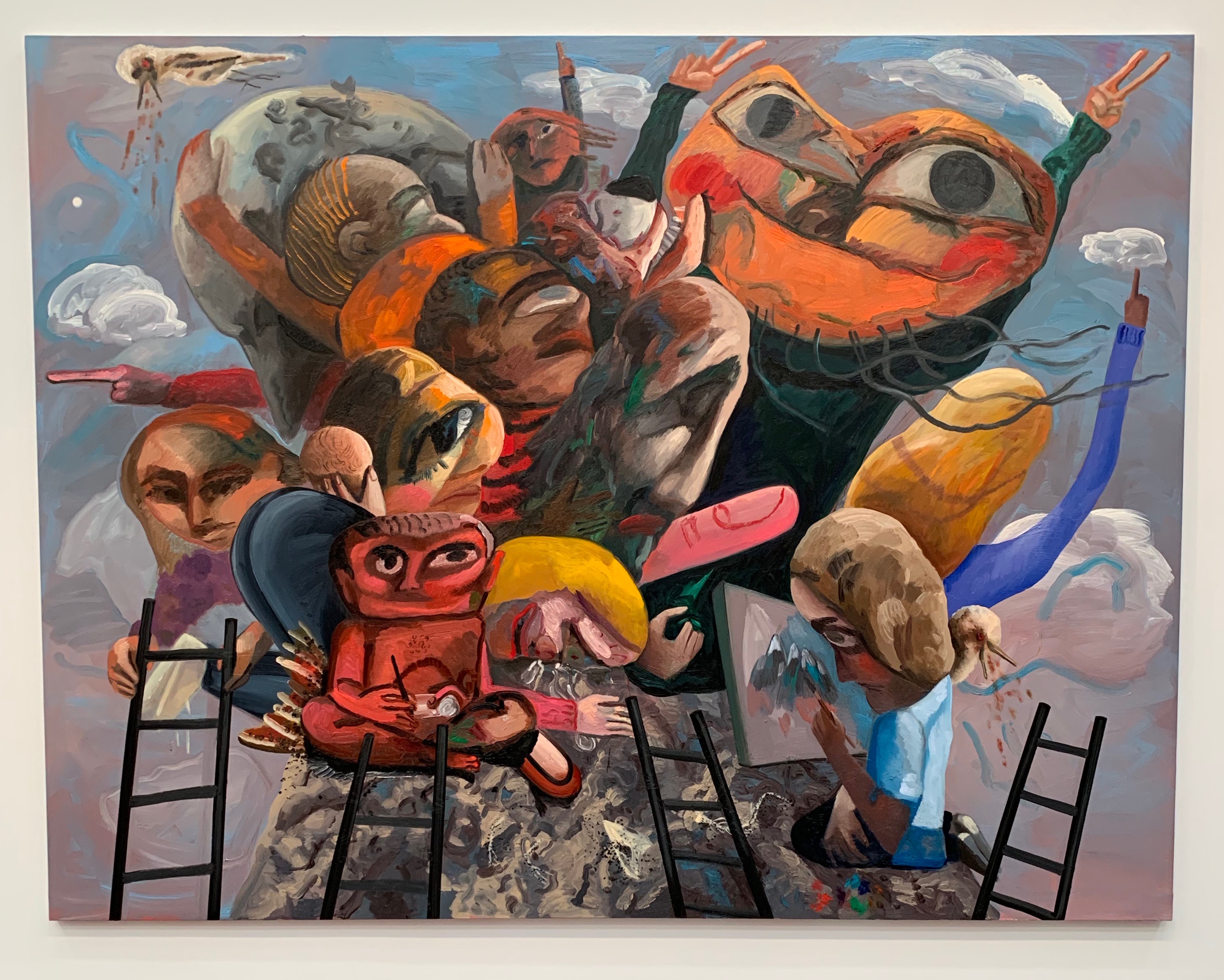
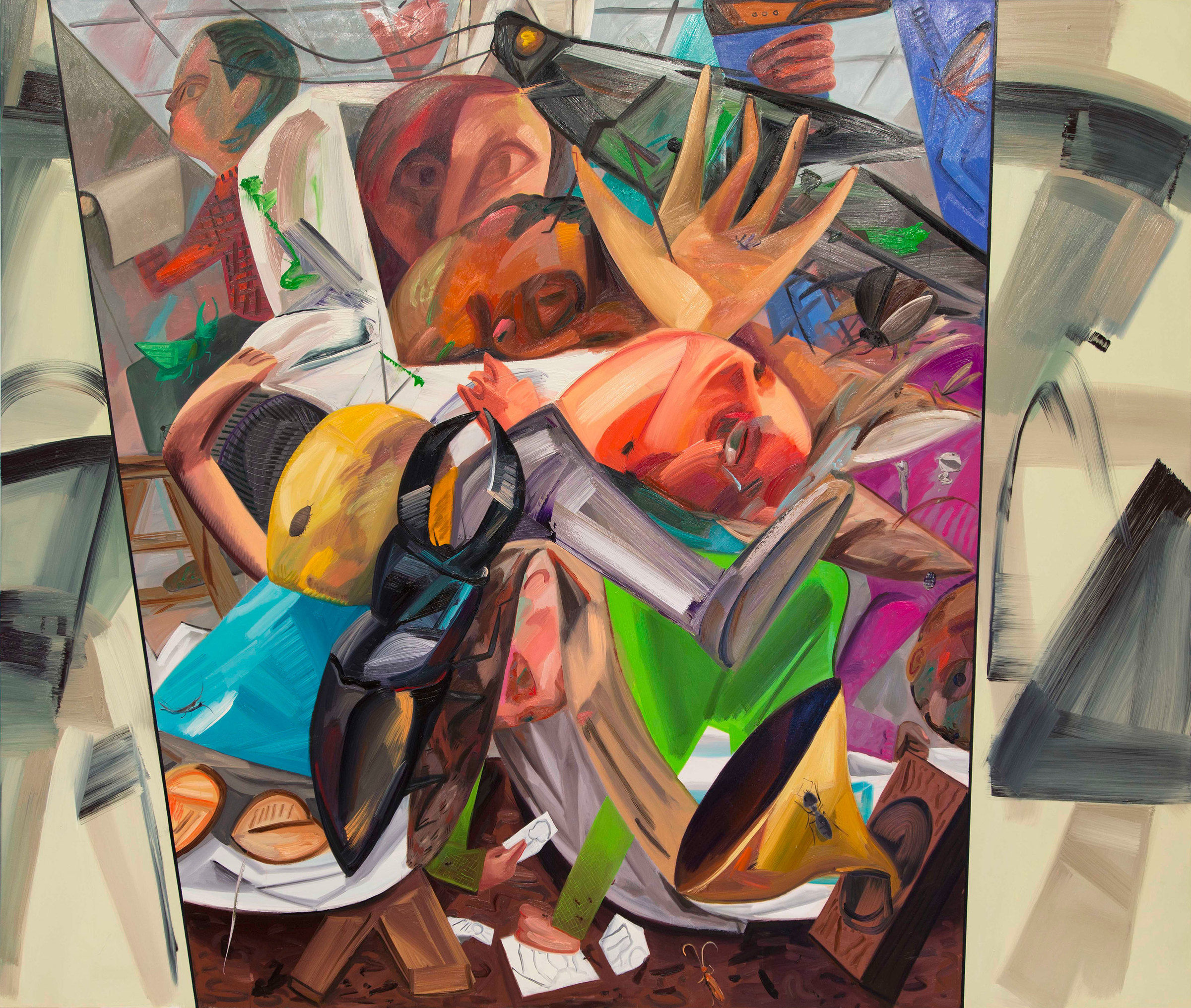
Artpolice was designed to be an artwork in itself, rather than a magazine of reproductions. That is, as a rule, magazines reproduce an artwork that’s primary existence is in another form, i.e., photographs of paintings. An issue of Artpolice is the final state, an artwork in its own right, as much as any other etching, silkscreen, or lithograph. The artworks inside not only made to the specifications (size, color) decided on by the editor for that issue, but also with the artists giving a great deal of thought to the strengths and weaknesses of the printing process. With this in mind, one can better appreciate not only their various stylistic decisions, but their medium choices too. For instance, there are artists such as McKearn or McDonnell who embrace a more traditional (if, in their case, warped) idea about serialized comics, and so their use of ink rapidographs makes perfect sense. The rapidograph is also the drawing tool of choice for Morgan and Corbit, but to very different ends. Morgan distills her images down to glyphs, playing with the history of instructional illustration, fashion, and pure pattern, while Corbit strives for density, and his pages are frequently the most intensely drawn. There are the artists who take their inspiration from woodcuts, like Denise Monaghan, and others, like Mike DeVoni, who make effective use of photo collage. There are artists like Woodward, Rath, Mead, and Baird who favor brush and ink, and those like Gaard whose hand-drawn mastheads and “newsletter” text drawings can employ ink, stamps, photos, and cutouts.
In short, there were nearly as many approaches and techniques as there were contributors, all coming together every three to four months for nearly two decades to make a collaborative artwork produced by individuals who continually strove to make a community for themselves, and a unique work of art for the rest of us.
Deven Golden
2021

Artpolice contributors:
Core contributors:
Frank Gaard
Robert Corbit
Fritz Wolfmeyer
Ed Rath
Denise Monaghan
Tim Walton
Ann Morgan
Bruce Tapola
Michael Brehm
Mike McCoy
Chis Woodward
Joe McDonnell
Gregory Miller
Jon West
Stu Mead
Mike DeVoni
Andy Baird
Occasional and single time contributors:
Peter Martin
Tim Miske
Mike Kassner
Paul Proch
Craig Smith
Bill McKearn
Pat McKearn
Deven Golden
Deb Silver
Mike Haiduck
Lillian Koponen
David Johnson
John Largaespada
Megan O’Connell
Mike Kelly
Christopher Wool
Mitch Corber
Rick Noble
Janet Groanert
Deb Huff
Mark Akgulian
Coleen Salmi
Carol Scalamera
Eric Burmeister
Jennifer Sobin
Steve Mignone
Melissa Stang
Terre Van Haren
Lisa Brooks
Jim DeWitt
Daniel Freeman
Janet Richard
Jean Ross
Bob Speed
Terry Tolman
Nick Sperakis
Colin Thompson
Fred Schulz
Doug Van Heerde
Alyn Silberstein
Lon Spiegelman
William J. Rice
Kurt Mahoney
Claudia Fitch
Dick Miller
Patti Boekhoff
Alex Swann
Ken Feingold
Muzo (a French artist)
Jane Filer
Don Holzschuh
Marc DeBauch
Keith Smith
Jim Casebere
Jim Albertson
Glen Grafelman
Joe Hoppe
Vicente Garcia
Joan Rothfuss
Christof Kohlhofer
Mark Bueide
Tim Piotrowski
Mike Etoll